Making an Illustrated Journal - Part One
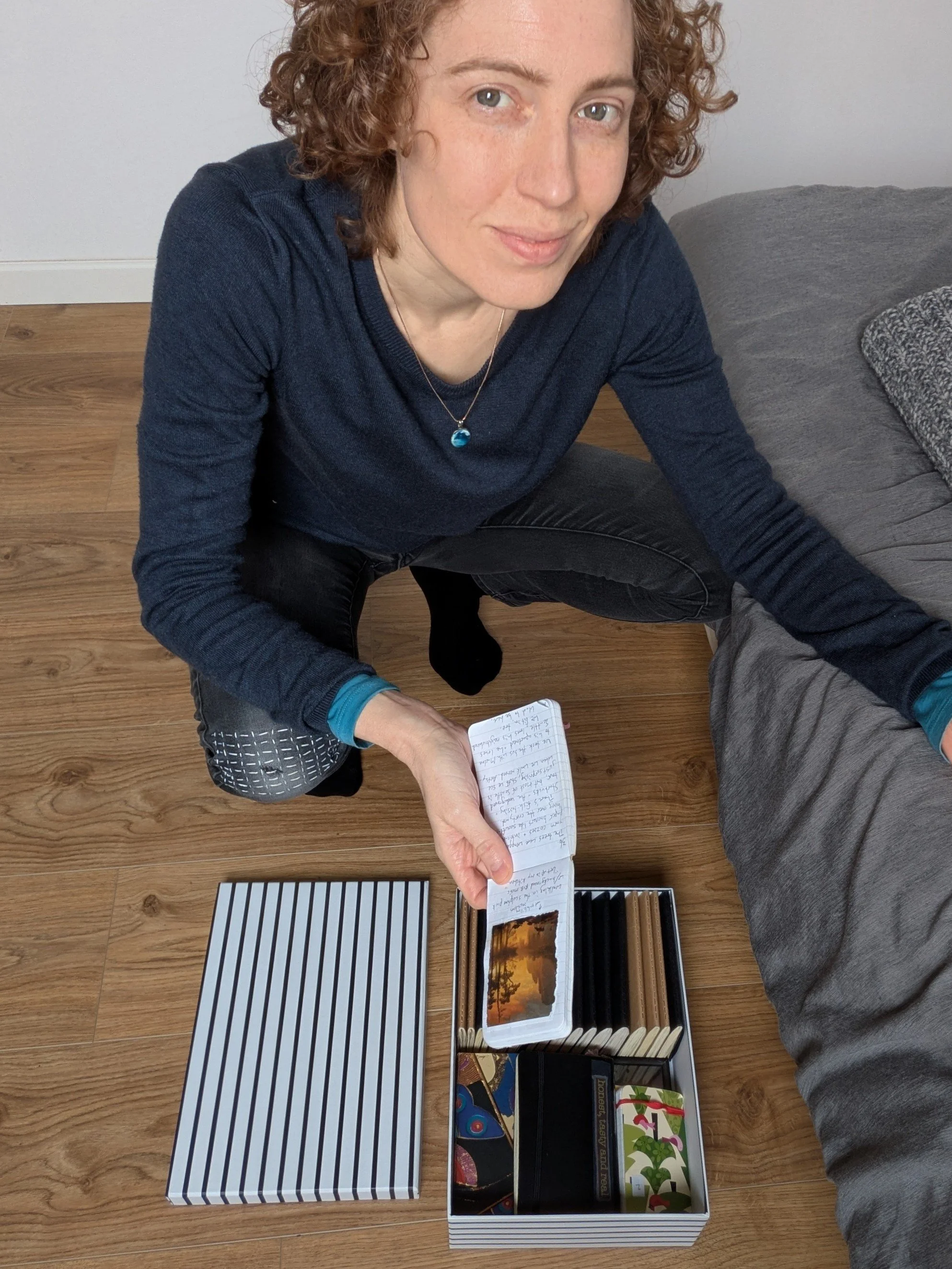
Stowed away in a little box, I have a set of 20+ journals from the beginning of my marriage, starting in June 2011. They document everyday life, often with scraps of paper taped in. The daily entries are sometimes mundane but, like a time capsule, they capture details that would've otherwise been lost.
I journaled religiously during that time because I liked how diaries preserved memories differently than photos. With a journal, I could keep snippets of conversations or candid moments that would've been ruined by the presence of a camera. It gave value to each day, too. It didn't matter how ordinary something was. If I wrote it down, it became memorable.
Although I no longer keep a journal regularly, I still love them. I only dislike how overwhelming a stack of journals can be. All those pages of writing, all unedited… It's too much to casually read through.
Besides occasional browsing, my journals have mostly stayed in their box. That seemed like a shame, so I'm slowly recreating them with illustrations and curation. This solves two problems at once: the journals are getting a second life, and I'm getting endless inspiration for creating art with gouache, a type of paint I wanted to try out.
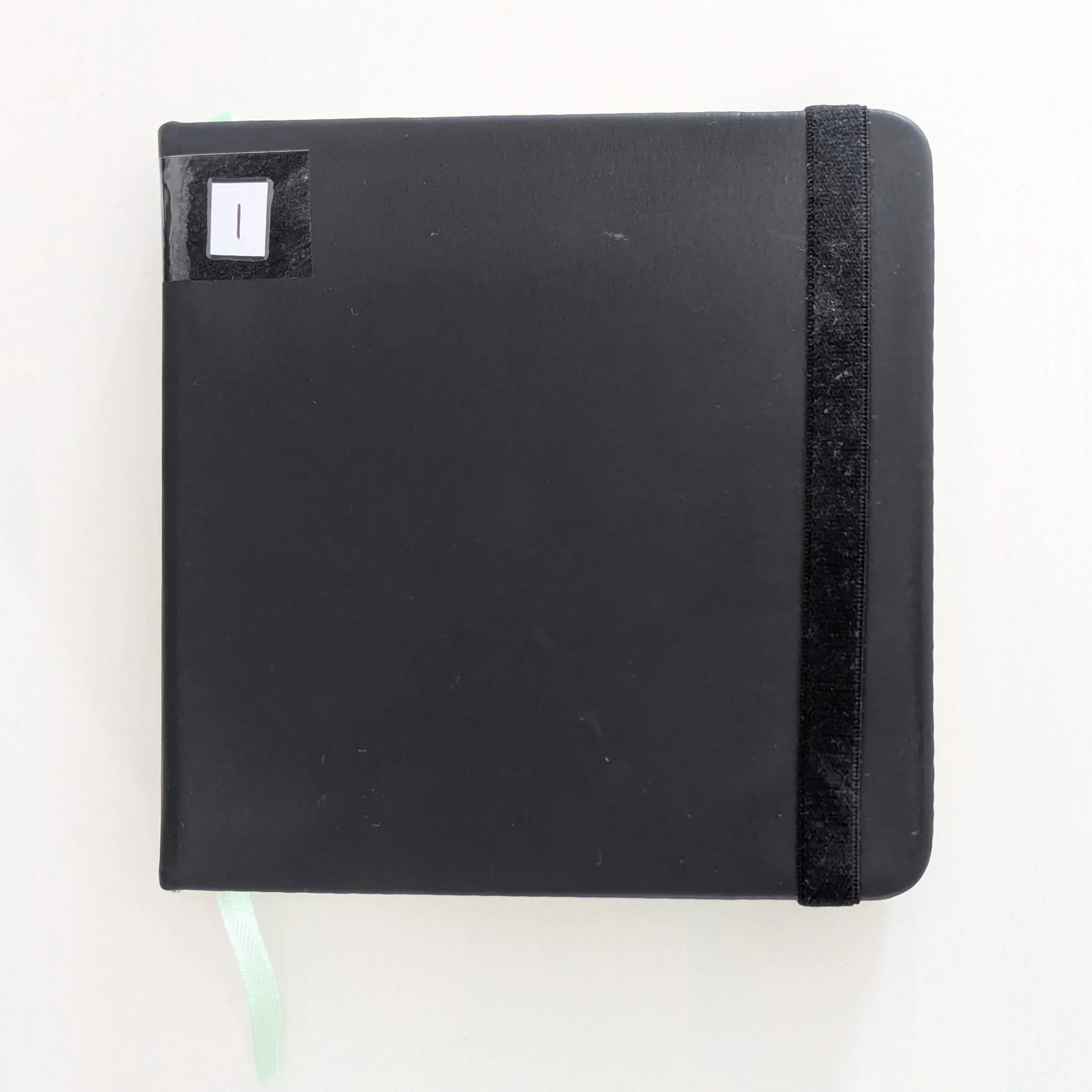
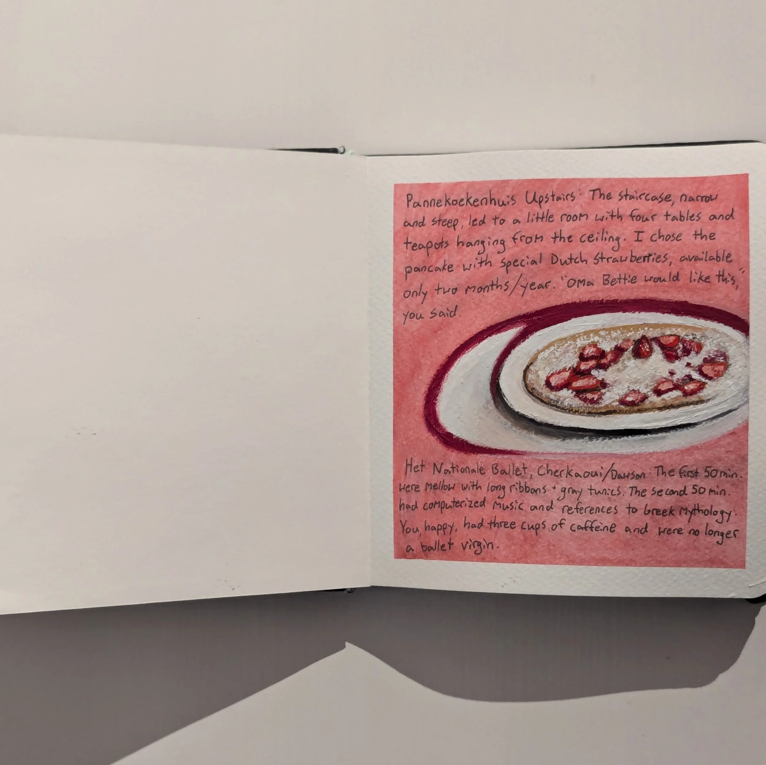
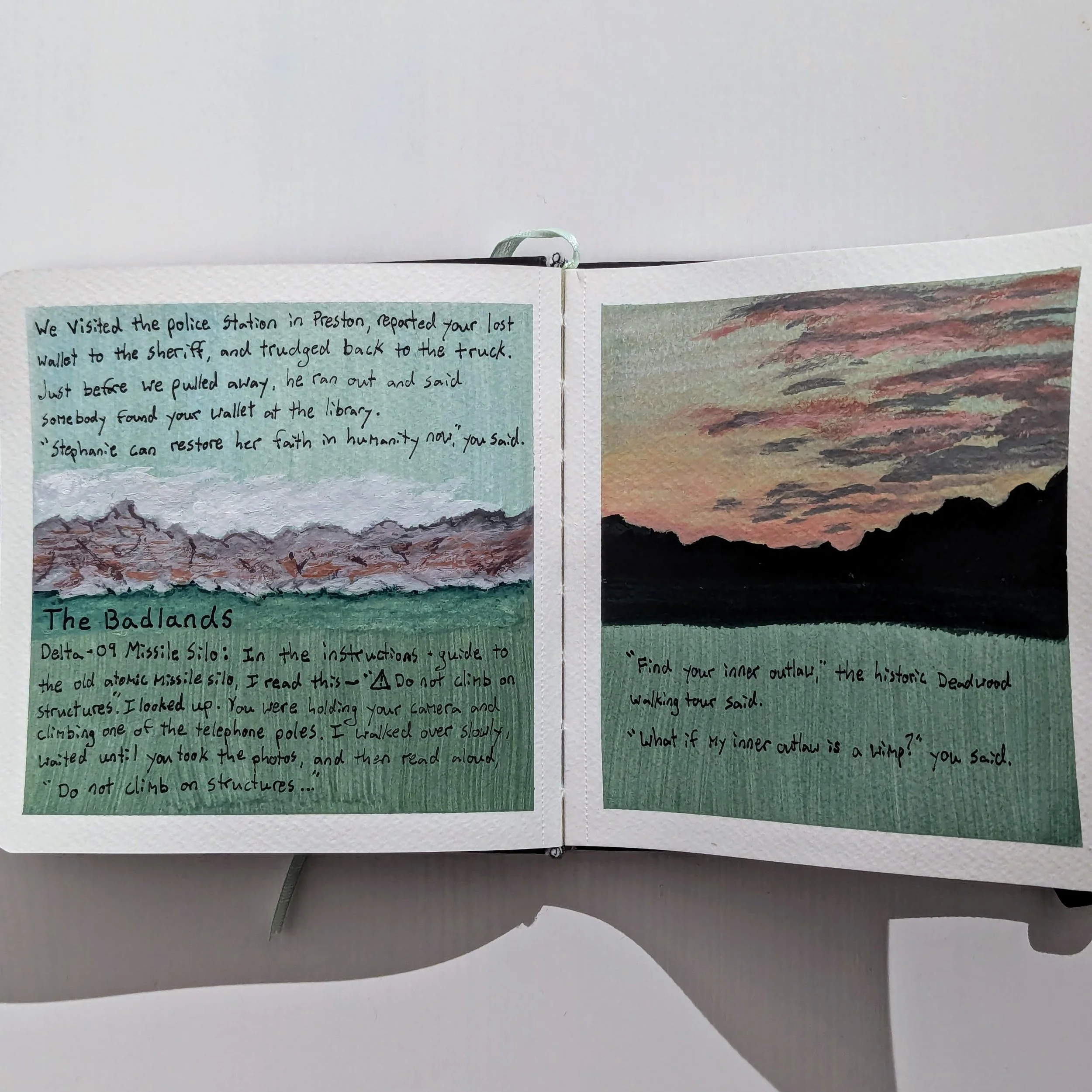
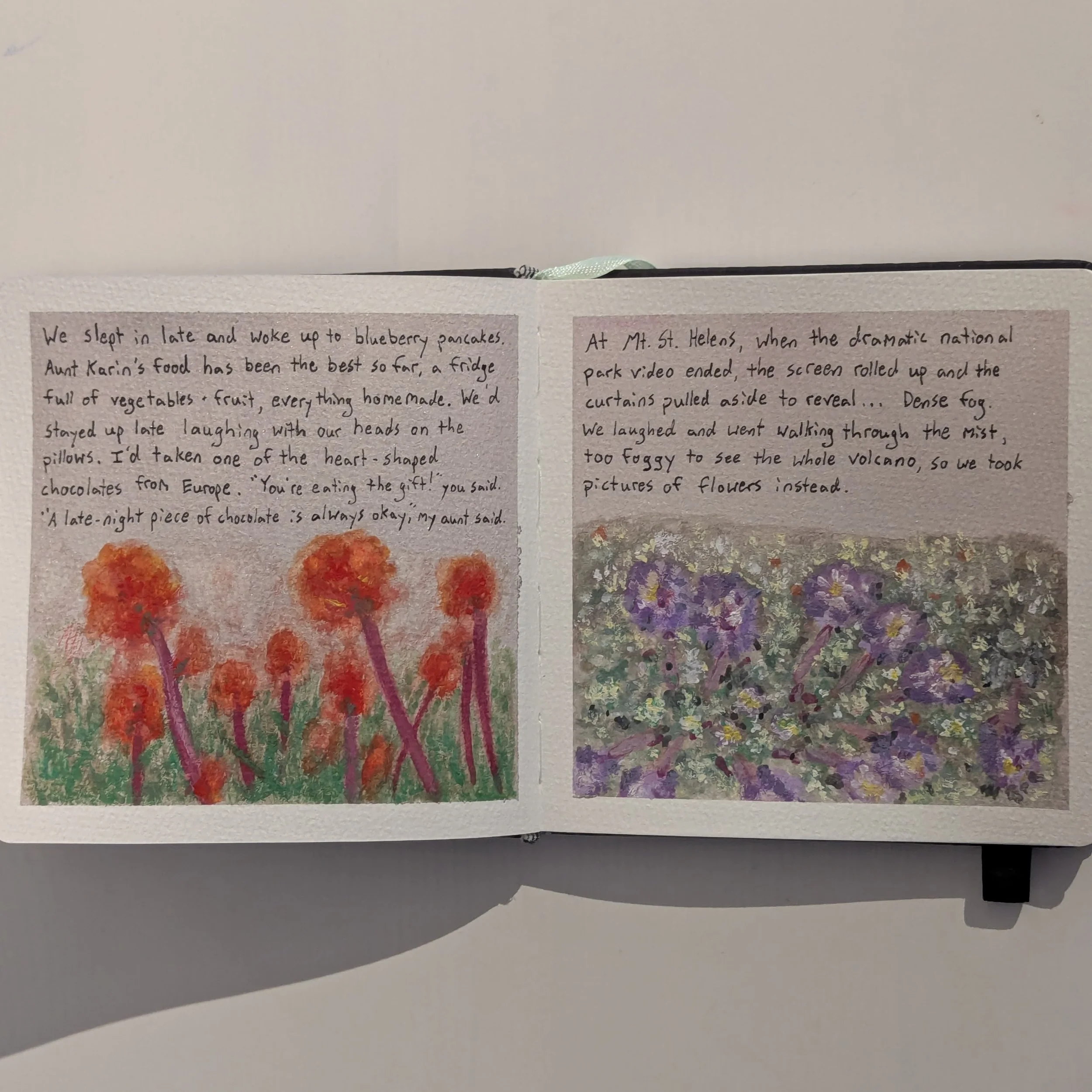
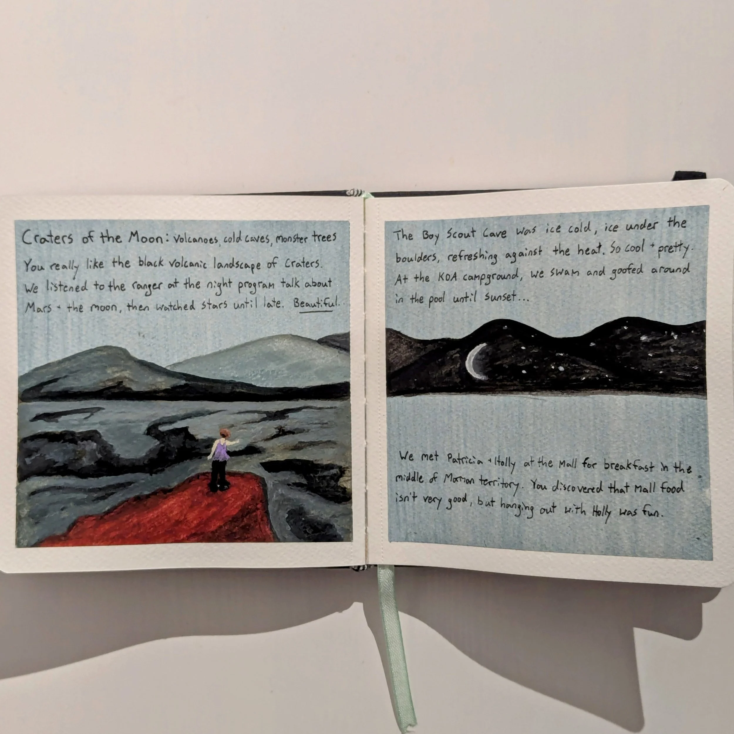
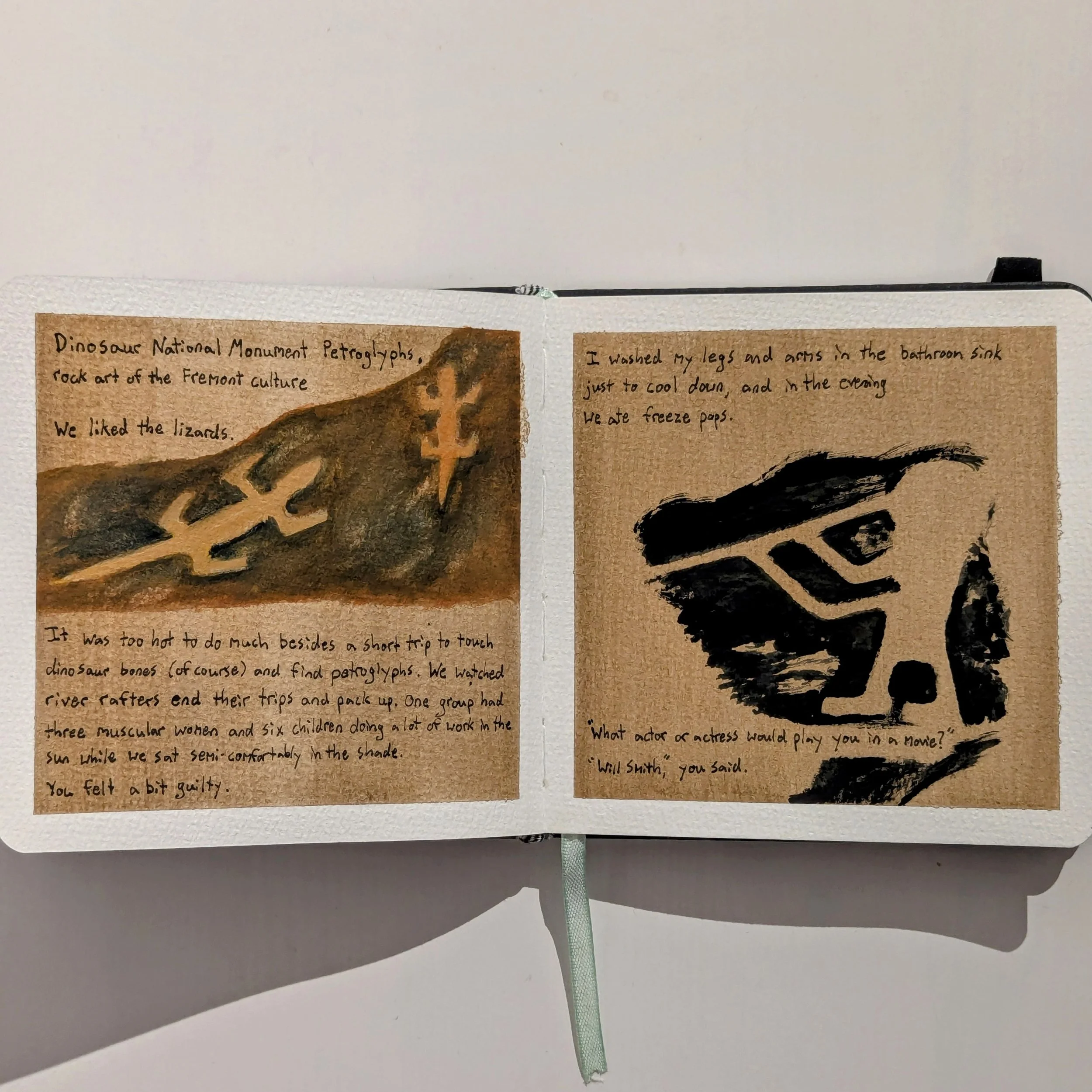
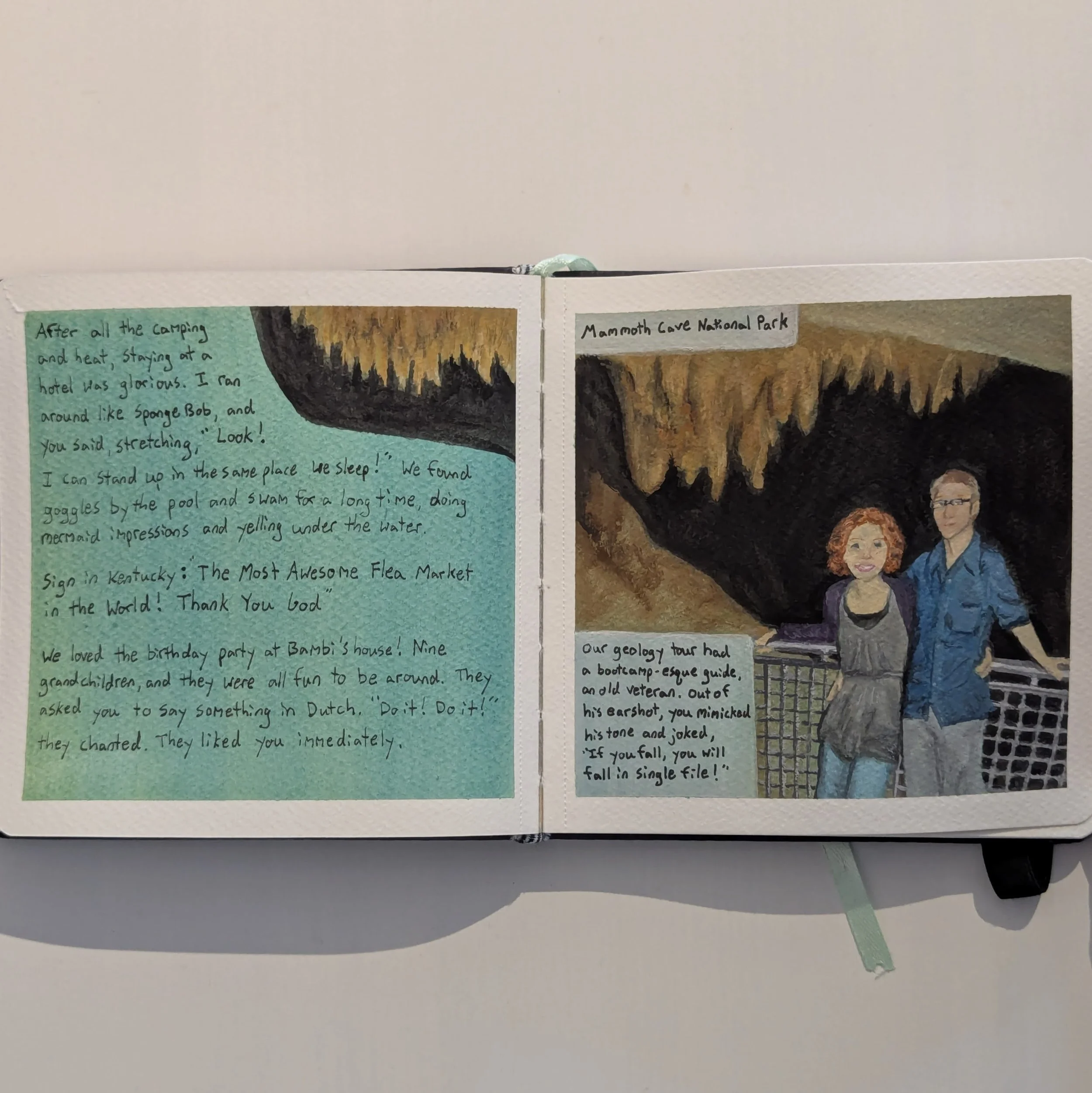
Now the first book is done, 48 pages of gouache and watercolor with writing in ink, covering about three months. Though relatively short, I've learned a lot already, enough to write a list of tips for myself to remember as I begin on book two.
Watercolor journal, 14 × 14 cm
Page 1
Making an Illustrated Journal - 8 Tips
1. Remember the text and illustrations are independent of each other.
Often in picture books and graphic novels, pictures and words are intrinsically linked. If you take either one away, the story loses meaning or becomes nonsensical.
But with illustrated journals, the writing can stand alone. The art can add depth or atmosphere to what's written, but it can also be a separate narrative running parallel to the text. It's not caged by the writing; it's a partnership.
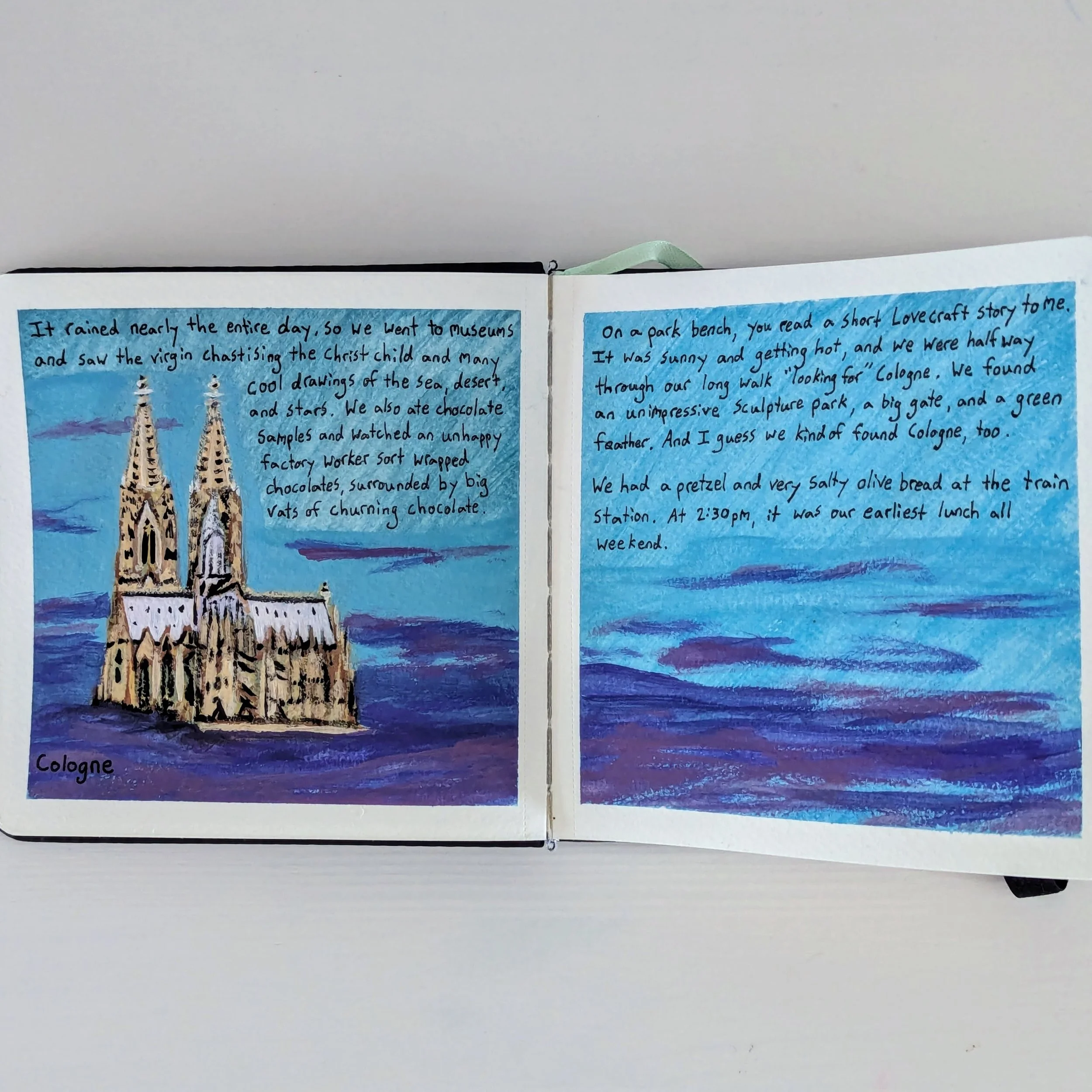
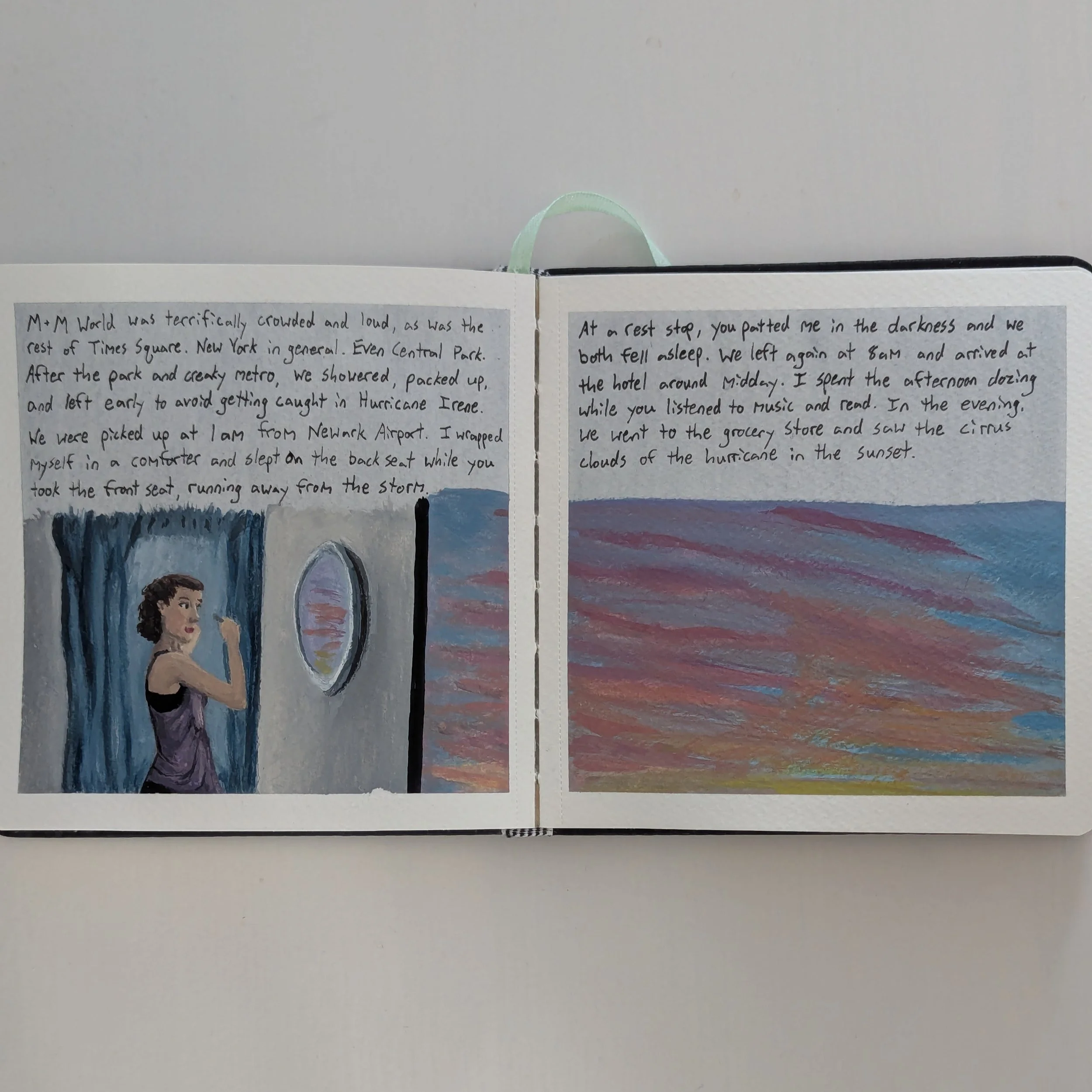
I first realized this on pages 4-5 when I painted the cathedral in Cologne to match the text. I didn't feel like painting the surrounding city, so I painted clouds around the cathedral as if it were floating in the sky. That added whimsy to the text, but the image could stand on its own, too.
Pages 2-3
Pages 4-5
2. Try to connect the images.
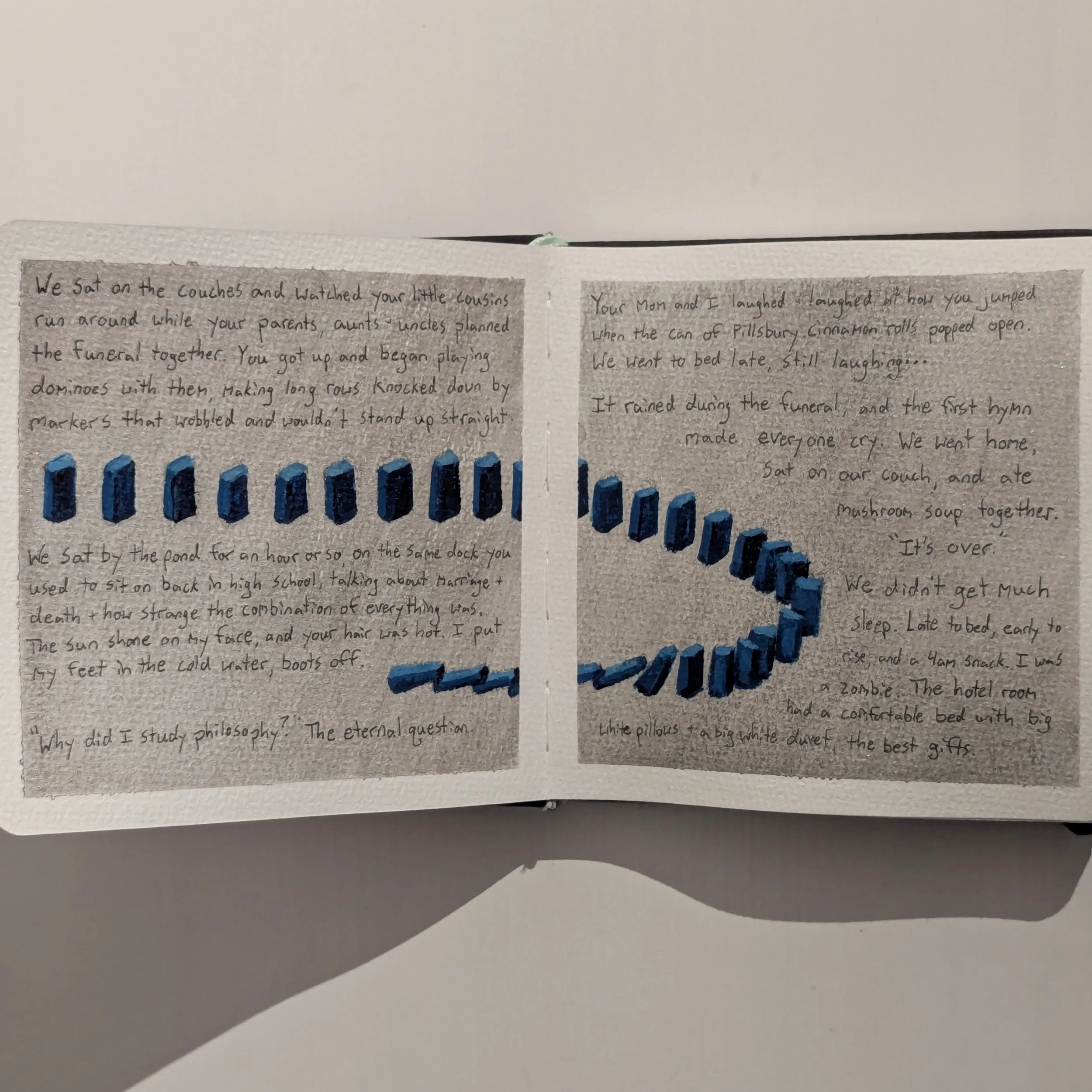
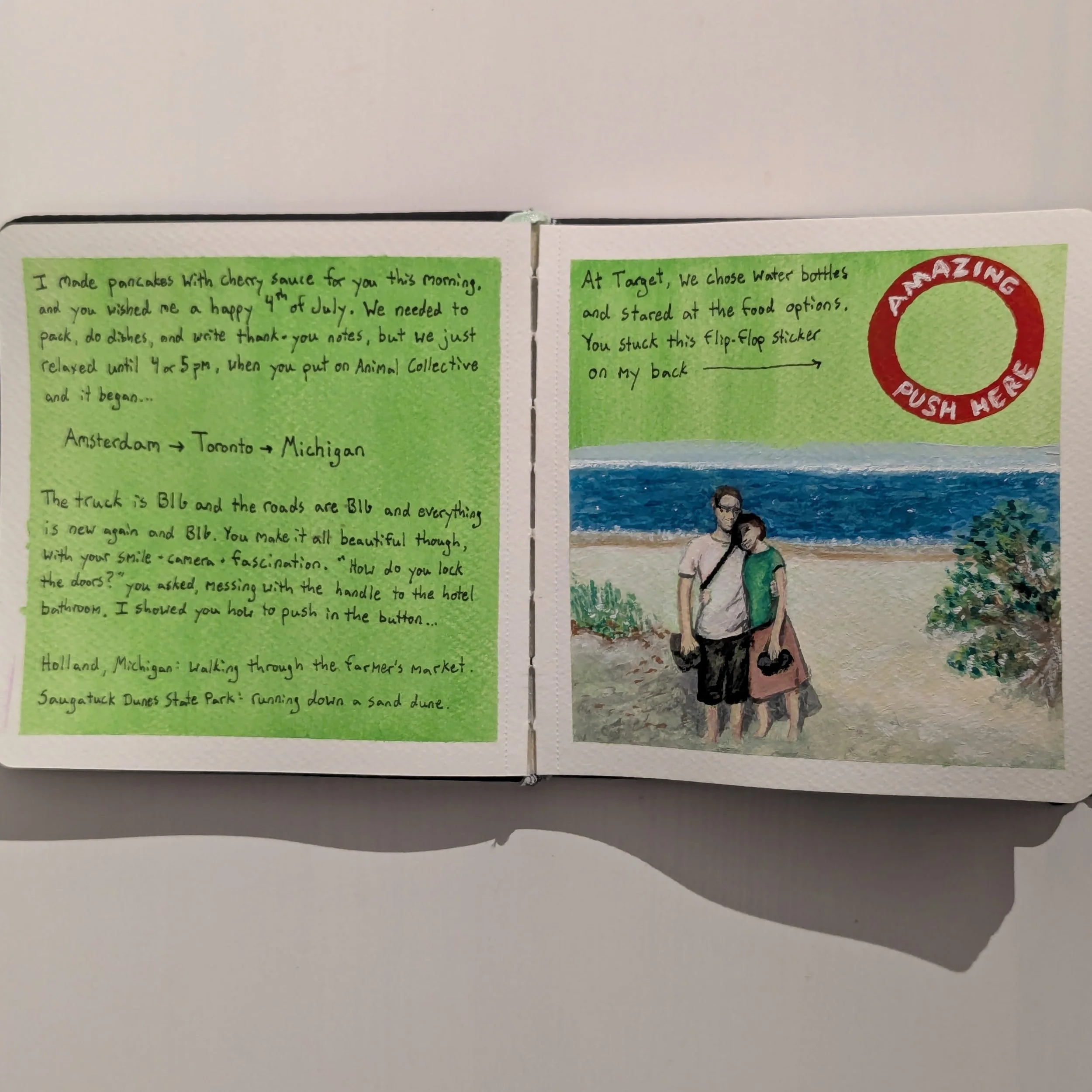
From the very beginning of this book, I loved thinking of different ways to make a two-page spread into a single image. But I didn't realize how important that connection was until pages 8-9, when I used one side for text and the other side for the image.
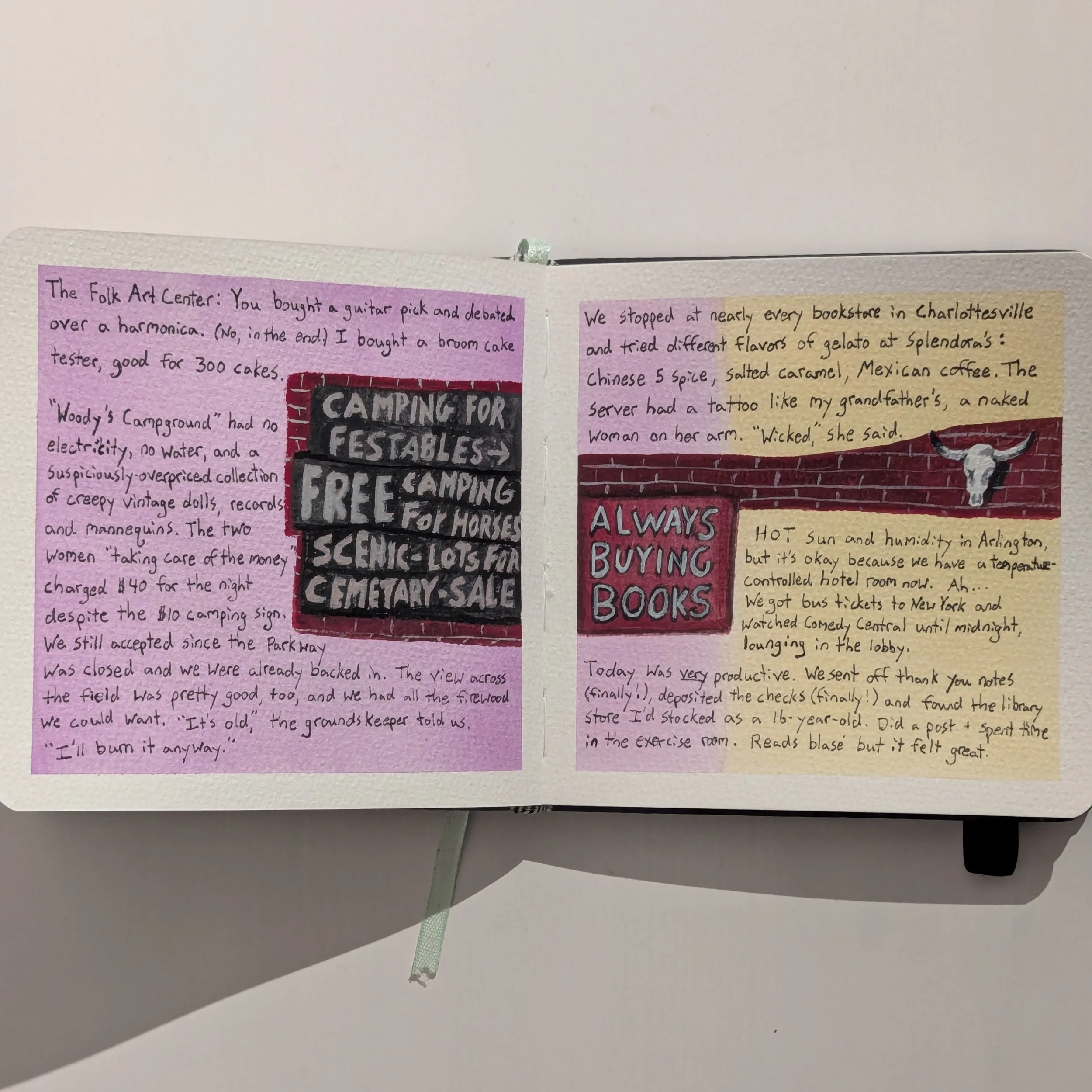
Even with the red circle and arrows adding energy, that two-page spread lacks the liveliness of pages where there's a visual jump between the two sides. Even if it's only a strip of color (like on pages 34-35), it adds cohesion and visual flow between the pages.
Pages 6-7
Pages 10-11
Pages 8-9
Pages 12-13
3. Keep space around the paragraphs.
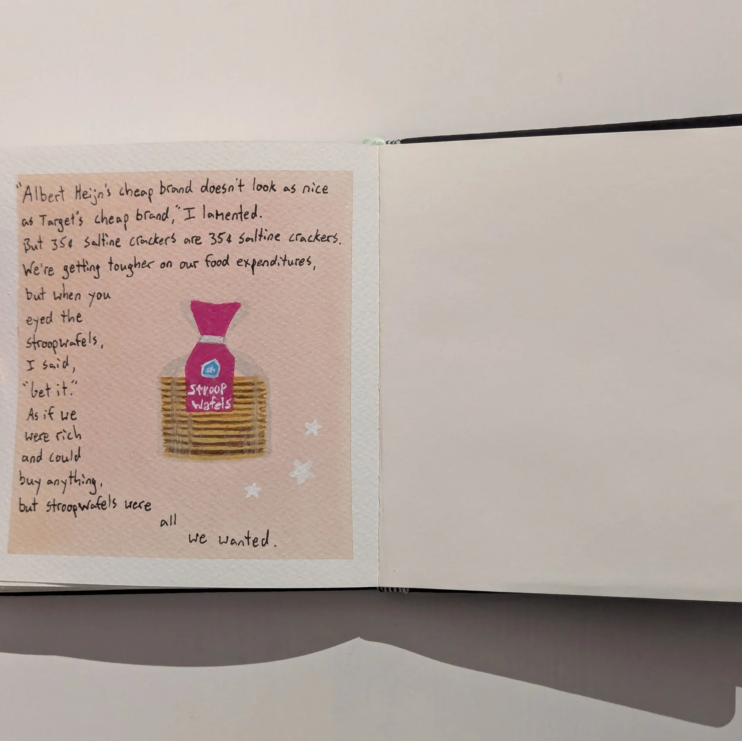
Sometimes I wanted to write two entries on a single page even if they were long and crowded the space. In retrospect, the pages I like best are more minimalistic (like page 21), keeping empty space around the text as if letting it breathe.
Similarly, I tried using ink dividers in a few places, imitating the style of magazines or comic books. That worked well between images and text (like on pages 16-17), but it had a harsh effect on page 15 between paragraphs. Dark slashes that interrupt the flow between paragraphs might be fitting in a grim journal with a stark atmosphere, but that style seemed off-tone in this journal of warm memories.
Pages 14-15
Pages 18-19
Pages 16-17
Pages 20-21
4. Consider the visual impact of the text.
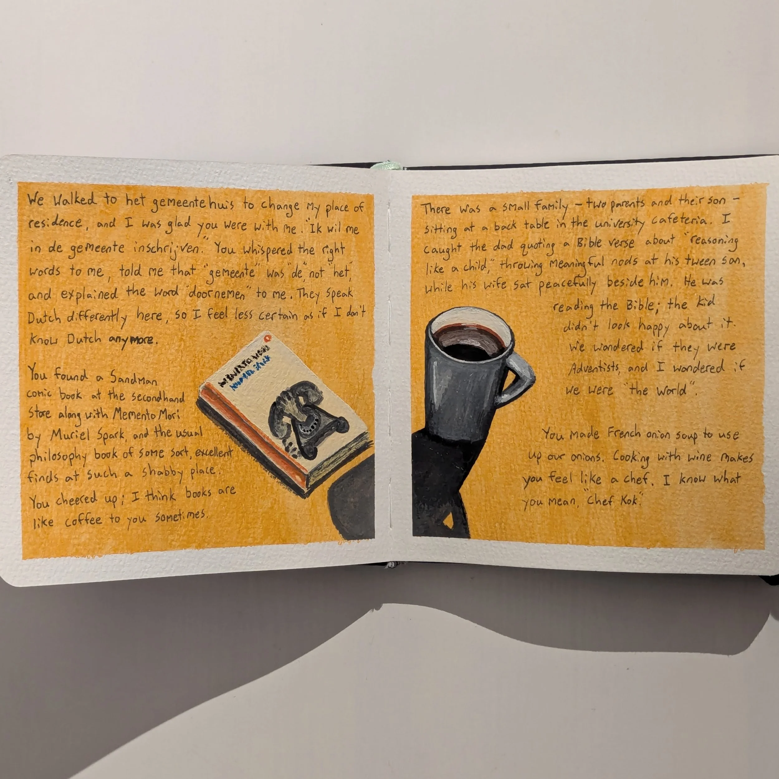
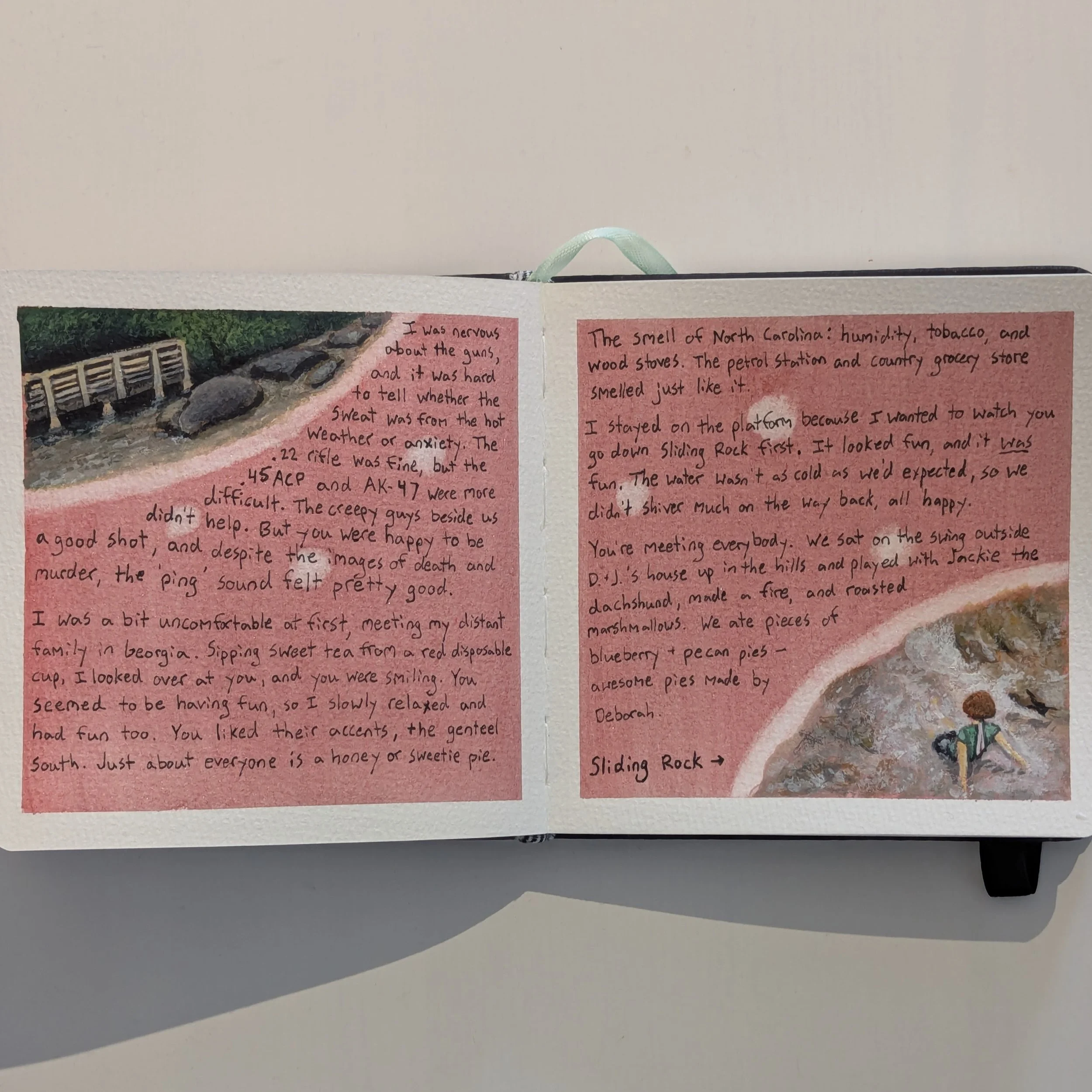
Typically I just transcribed words directly into this book without much artistry, but a few times, I thought about the visual impact of the text, too. For example, the lines on page 23 are separated like a poem, and on pages 42-43, the paragraphs have a downward slant leading to the phone.
I could play with the shape and placement of the words a lot more, maybe even get into calligraphy. I tend to view the text as plain prose - paragraphs written in straightforward blocks - but they could be poetry or pieces of art as well.
Pages 22-23
Pages 24-25
5. Give the background more thought.
Before painting in gouache, I used watercolor to create a background for each page. I took inspiration from Dina Brodsky, who uses acrylic ink to shade the background of her sketchbooks.
I plan to experiment with acrylic ink in the next book, but for this one, I chose watercolor because I've always struggled with that medium. I wanted to test it out without the difficulty of making images, just mixing colors and seeing how the brush strokes affected how the paint moved on the page.
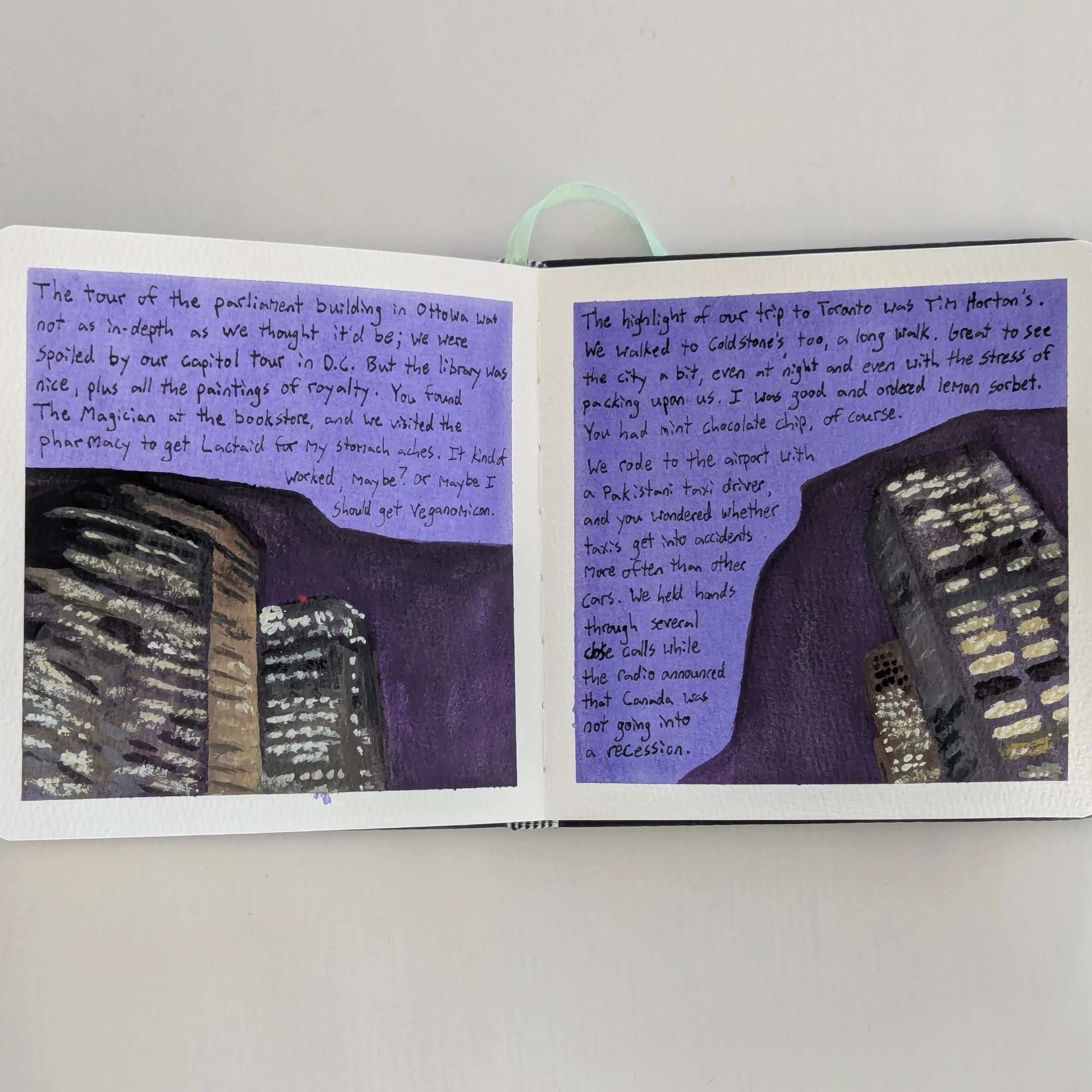
I still don't love it (yet), but I've at least grown to appreciate how nice the medium can be for background skies (like on pages 28-29) and for vibrancy in general. I tend to dismiss the background as a minor decision, but it could potentially be as important as the other components on the page.
Pages 26-27
Pages 30-31
Pages 28-29
Pages 32-33
6. Play with magical realism.
I love how journals are both fiction and nonfiction. They document real events via one person's mind, which might skew or change those events. At the very least, the overall tone can influence how readers perceive people or events, similar to how tense music can make a peaceful setting feel scary.
Even when I read my own journals and relive those memories, they contain an element of fiction because I had only a single page for each day. I had to make choices. No matter how truthful my words were, I was creating a story just by excluding certain details.
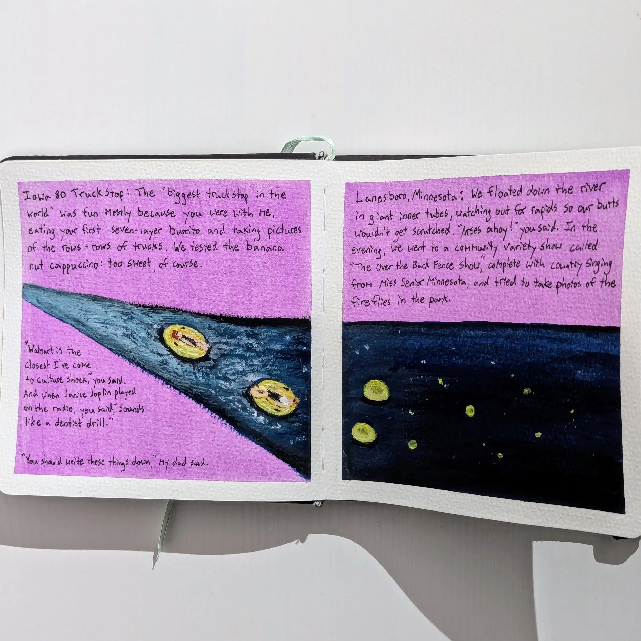
For that reason, images with a touch of fantasy or magical realism (like on pages 10-11, 20-21, and 36-37) seem especially well-suited for illustrated journals. Like the text, they ride the line between fiction and nonfiction, making the story element more obvious.
Pages 34-35
Pages 36-37
7. Use full-page images to emphasize certain experiences.
Often illustrations are put alongside text as a supporting actor. The text leads the way, and the images follow. However, there are times when an experience is so memorable, it deserves more attention. In those cases, larger images are better than more words.
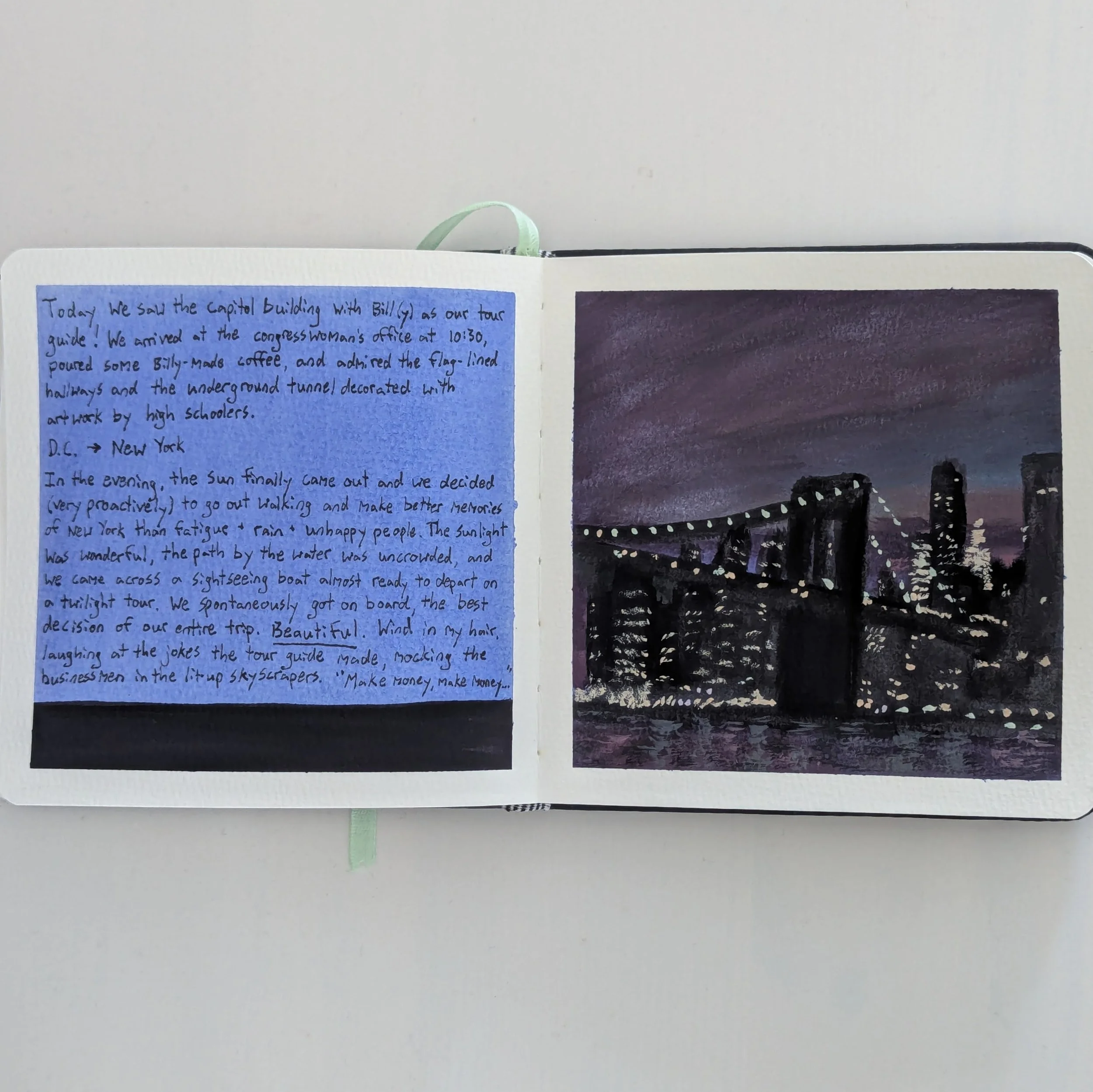
This became clear on page 35, when I used a full page for an image of New York. I'd done a full-page image before (page 25), but I'd added words which detracted from the image. When the image is free of words, it stands out from the rest of the journal, making that scene or experience appear more special.
Pages 38-39
Pages 40-41
8. Make space for "bad art" and experimentation.
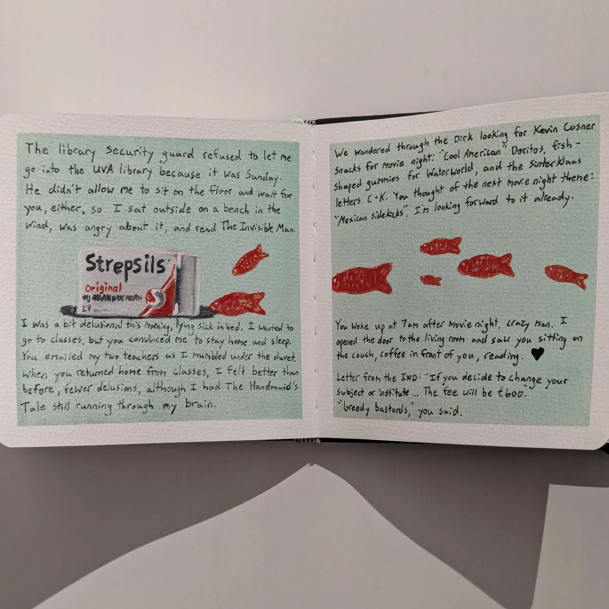
Whether art is “good” or “bad” is a feeling influenced by culture, status, identity, and relationships. When my art feels good, that simply means it's closer to my own style or preferences. When it feels bad, it's the opposite. For instance, I personally think pages 14-15 and 18-19 are bad, whereas pages 12-13 and 42-43 are good, but others might disagree.
Creating bad art is essential for learning and expanding your skills, but it's hard to foster a “safe space” where bad art feels nice instead of frustrating. I've tried using messy sketchbooks or loose papers for practice and experimentation, but spending hours on hidden work, later discarded, was discouraging. I slowly felt pressure to make everything "good" so my art would be treasured (by me) instead of trashed.
This illustrated journal is the closest I've come to having a safe space where I feel relaxed with experimental or bad art, since no matter what I create, it's special and worth keeping. After all, journals with mediocre art are more interesting than journals with no art at all.
Realizing that, these journals have become where I play and practice with no pressure, whereas high-quality canvases are where I make demands of myself. My main goal isn't to create better and better art in these books, but simply to give my old journals a new life (and have fun in the process).
Pages 42-43
Pages 46-47
Pages 44-45
Page 48

